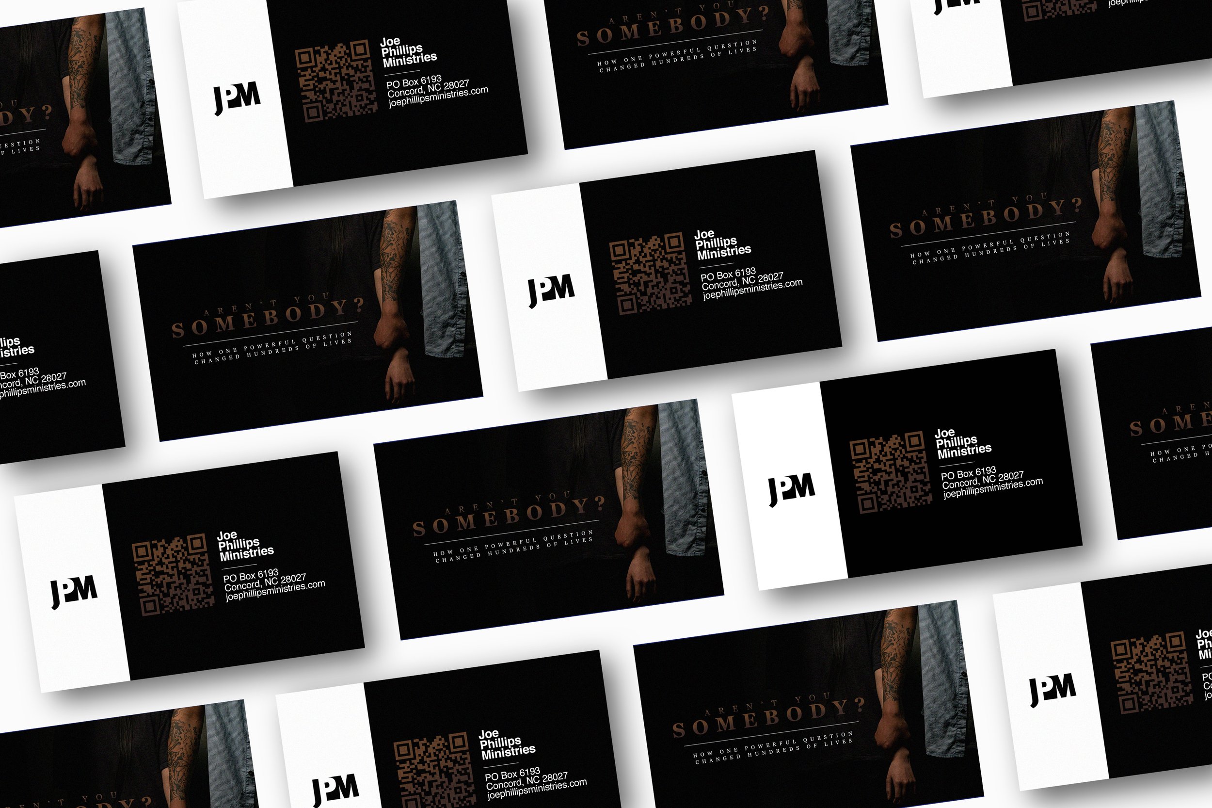
Aren’t you somebody?
The director of this film was seeking to utilize imagery and marketing that communicated both the seriousness and redemption found in the film. The design features darker color tones with contrasting fonts to communicate this dichotomy.


